Practical Graphic Design by Kyle Aaron Parson on SkillShare
CMYK (print) vs RGB (screen) color
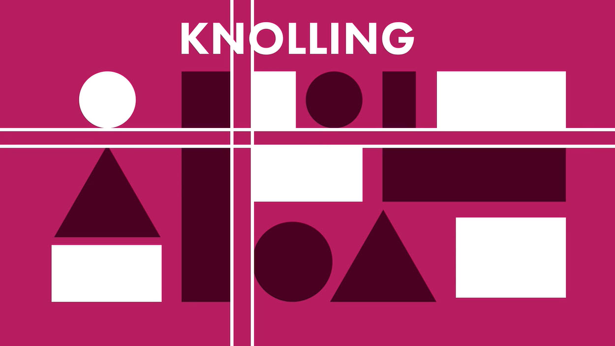
Knolling – organizing things along vertical or horizontal lines to a key object
Consider alignment, it should lead our eyes
Hierarchy – consider size, color choice, contrast, and orientation
Typography – consider size, style, color, leading, and orientation; limit yourself to two per design
Text threads! Connects text boxes for text to waterfall to next
Empower your Brand by Aram Atkinson on SkillShare
You need to understand your “why.” If you don’t know, then start with understanding what you do and keep explaining why that’s important until you can’t distill it any more. Each why will help you make informed decisions.
Identify your hero. They’ll communicate your message. This can be a fictitious character.
Identify the nemesis. They’re who (or what) causes the problem. They probably won’t see themselves as the villain.
We like faces/people. Having characters give us someone to connect with
Define your genre (tone)
What is the conflict and resolution? We are compelled by stories, figure out how to tell yours
Don’t forget your characters or tone in your posts
Remember to consider generally accessibility things. You’re missing people to connect with if your colors don’t work or if you don’t have any captions.